
|

|
|
Home Site Search Contact Us Subscribe
|
|
The SFMoMA and Us How Botta and Snøhetta each captured something about who we are. By Geoffrey Scott Gainer May 5, 2016 The San Francisco Museum of Modern Art (SFMoMA) is about to open its long-awaited addition – an addition wildly different in style, character, and concept from the brick original. While the old brick edifice anchors its site, throne-like, self-confident; the new addition leans, eroded, drifting as though buffeted by wind. Unalike as they are, they fulfill the same purpose. They share the same collection. They were commissioned by the same museum board. So why are the two so different? Why does each look the way it does? And do the designs "mean" anything? The answers to these questions reveal not only the magnitude of the contrast between the two, but just how dramatically we ourselves have changed in a mere 20 years.
The old and new halves of the museum, broadly speaking, could be thought of as offspring of the two main reactions against modern architecture – Postmodernism and Deconstructivism. By the 1980s, the Manhattanized San Francisco skyline was a showcase of how much life had been drained from modern architecture. What looked clean had become antiseptic. What was refreshing had turned stale. The exciting marriage of structural efficiency and minimalist lines had grown dull and uncommunicative.
To postmodernists, playing with familiar historical forms could reintroduce meaning into architecture. Columns spoke of authority, triangular pediments crowned culturally-significant buildings, over-sized doors announced an entry. Our collective cultural memory was the foil to Modernism’s alienating rationalism.
Deconstructivists, on the other hand, denied any real meaning could be conveyed through architecture, but created expressionistic works out of the complex realities of building. All the messy mechanics that Modernism kept hidden behind clean curtain walls came tumbling out into view like a tawdry scandal.
Theories may have differed as to how best to make a statement. But by the time SFMoMA was ready to commission its own building, the need for architecture to express itself was a given.
* * * * *
In 1988, SFMoMA was a second-tier museum with a patchy collection, confined for its history to the narrow halls of an old government building. Not only was it eager for its own home, it needed a building to herald the museum’s arrival on the national scene. The museum board held a competition to find an architect, but soon aborted it as the authoritative, monumental style of Swiss architect Mario Botta became their clear favorite. His style exuded the authority they were seeking. Even the architect himself had pedigree – a pupil of the Italian maestro Carlo Scarpa, and tenured in the offices of Modernism's giants, Le Corbusier and Louis Kahn. Not only would the gravitas of a Mario Botta declare the SFMoMA a world-class museum, his classic forms answered a pining for rootedness and familiarity that lingered from the economically-depressed and socially-conservative 1980s.
Botta’s eventual design displayed a refined, European-type Postmodernism – an assemblage of classical forms in modern drag, with none of the cartoonishness of the American variety. Like San Francisco's Renaissance-revival City Hall, it had a broad rectangular base, a central atrium crowned by a prominent rotunda, and a classically ordered, symmetrical, and hierarchical façade. It was the architecture of the establishment. It lent its holdings an air of comprehensiveness, and it pronounced the museum a world-class institution with unassailable authority.
Twenty years on, the museum has become a venerable destination. Its programs extend around the Bay Area. The collection has expanded and rounded out. And once again the growing museum has commissioned a new building.
But amid the optimism and bravado of a tech-driven economy, the expanding museum’s board has chosen a very different architect for its addition. Far from repeating Botta's staid declaration of the museum's legitimacy, the New York- and Oslo-based firm Snøhetta has dropped a cliff-sized chunk of nature into the South of Market district, a design closer in affinity to that other great reaction to Modernism – the asymmetrical, off-balance forms of Deconstructivism.
To say that Snøhetta’s design is Deconstructivist would be off the mark. Deconstruction started out as a method of unveiling suppressed inconsistencies in philosophy and literature. Classics were scrutinized for specious assumptions and fallacies were exposed. The practice came to be applied to architectural conventions as well. Modularity and mass-production was efficient, but can one pre-fab solution plug into all of life’s gritty realities? Exposed, repetitive columns made for honest-looking structure, but don’t they straightjacket our aspirations of freedom? Early Deconstructivist buildings turned such modern ideals as function and geometric purity inside out. Grid-like plans and orderly façades were fractured and split. Buildings were designed as though some giant had twisted, stretched, and distorted the rectangular glass box.
Popularly taken to be a new "style," less philosophically-inclined architects treated it as license to design in whatever jaunty fashion they pleased. As visitors flocked to these attractions, other institutions began to commission eye-popping designs in a mass if-you-build-it-they-will-come mentality, and a silly sort of one-upmanship ensued as clients and architects pursued bolder and wilder designs. Unlike the first generation of Deconstructivist buildings though, the latter indulged in sculptural shapes for their own sake more than as a critique of modern architectural conventions. The response to all this was much like that to the parade of avant-garde art earlier in the century. The novelty faded.
SFMoMA’s search for a new architect came in the wake of this craze. Many offices were designing in flamboyant and sculptural ways. Digital design was showing its potential. High-tech pragmatism still abounded. Old-school Modernists were still practicing. So why Snøhetta?
Ask the selection committee and you'll hear about the doubling of visitors over the last 20 years, projections for future attendance, and the difficulty of designing proper circulation through a quirky urban site. Snøhetta, along with consulting engineer Arup, have certainly proven to excel in such conditions. Snøhetta’s reputation for interpreting complex program requirements will be mentioned, as will its ease in working with large institutions.
These are all very sensible answers. But the business of aesthetics was ultimately entrusted to Snohetta’s team. Due to the firm’s famously egalitarian structure, however, no trademark look could be expected. Snøhetta had a blank slate. So what impetus did they have to depart so radically from the existing aesthetics? Why the shift from the monumental to the irregular? From an icon of singularity to the very image of entropy?
* * * * *
All varieties of recent buildings have gone up locally in styles that would have seemed quite libertine in the 1990s. It’s easy to be daring in a robust economy. But the new design of the SFMoMA reflects a deeper something than what the exuberance of our current building boom has produced. Culture has undergone a seismic shift in a mere 20 years. And the contorted, irrational forms that looked so disturbing when they first emerged now seem befitting of our world’s less savory qualities. We haven’t become just inured to the unsettled compositions of Herzog & de Meuron’s de Young, Libeskind’s Contemporary Jewish Museum, Morphosis’s Federal Building. We feel something resonant in their forms as well.
Twenty years ago the nation felt indomitable. We had just emerged victorious from the Cold War. America’s hubris was still enshrined in the World Trade Center buildings. Ecology was a dead fad and the OPEC oil embargo a mere memory. Phone cords were just starting to be plugged into the backs of computers. And the human genome map had yet to reveal the mysteries behind our advanced evolution.
Today’s world breeds more diffidence. We are a guarded species, sobered by the specter of global climate disruption, preoccupied with terrorism, and genetically 88% mouse. Our government’s intelligence network and criminality have been unveiled as Orwellian. Biologists warn of mass extinction, anthropologists cite natural resource depletion as the cause of civilization collapse, and the idea that our own civilization may be drifting down the same path doesn’t seem that far-fetched.
We have been sobered by forces beyond our control before – the mechanized slaughter in World War I, nuclear threat during the Cold War. But such self-deprecation as we see in recent buildings has never manifested itself before. Is this the message of Snøhetta’s design?
Botta’s message was clear: the museum bore authority and legitimacy, and so do we. Snøhetta’s design allows more room for interpretation. The transplanted slab of nature, sliced off at the ends as if to fit the lot, comes from somewhere else. It is not of our making. There is something aloof in Snøhetta’s precipitous natural form. There may be an indifference to us in the surrounding office towers, but it is a corporate indifference. What Snøhetta gives us is the indifference of nature. If our world now is one of climate disruption, resource depletion, and extinction, is the museum’s broad, weathered wall a testament to forces beyond our control? The image of a plundered resource? A monument to what was here before we were?
Snøhetta’s co-founder Craig Dykers, while less specific about his message, acknowledges our estrangement from nature: “Wherever we live we are surrounded by landscape. It is easy to forget this when we live in dense urban conditions. But if you simply peel back the asphalt there is soil, geology, and topography that is the foundation of the city we have built.
“As living conditions grow more dense, we tend to base our constructions more on abstract principles, so the connection to our natural world diminishes. But as humans we are both intelligent and feral, and it seems important that, at times, we are made aware of what our natural condition is. Because of this we have, at times, looked to imply our natural world, even in the midst of a city, to help us remember where we actually live, not just how we occupy.”
In other words, it may be nature that we are cut off from, but the affliction leaves us at odds with ourselves. “This in theory,” Dykers says, “should help us socialize in more humane ways, help us interact and become more active – all conditions of well-being that nudge us in the direction of being better as people.”
Whether the effigy of nature can help draw us together, the Snøhetta addition does complete a picture. SFMoMA can be thought of as a duality now: the image of an individual against the backdrop of nature. Where once on Third Street our hubris stood alone, it is now shadowed by an acquiescence to nature. Botta's great cathedra gazes west, over Yerba Buena Gardens. Snøhetta's cliff face looks east, toward the future Transbay Terminal and the bay. The two buildings stand back-to-back, dueling reactions to the blank-faced modernism of the surrounding district, dueling outlooks on our relationship to the world.
Geoffrey Scott Gainer grew up among deep wooded surroundings in a Hugh Newell Jacobsen house. With a BArch from Virginia Tech, he moved to San Francisco in 1990 and founded Actual-Size Architecture, where he continues to relate architecture with nature, and modernism to history. |
(click on pictures to enlarge)  Geoffrey Scott Gainer View from Yerba Buena Gardens: the windows of the upper-floor administration offices in Snøhetta’s new addition overlook Mario Botta’s original.  Geoffrey Scott Gainer Just a glance of the trademark weathered façade is visible from the entrance.  Geoffrey Scott Gainer Snøhetta and Botta buildings peek from between Maki and Polshek art centers amid surrounding high-rises.  Geoffrey Scott Gainer The east face from Jensen & Macy Architects’ 2006 sculpture garden.  Geoffrey Scott Gainer The east façade’s fiber-reinforced polymer panels loom over the entry. 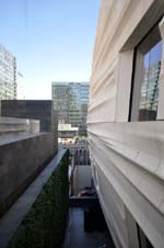 Geoffrey Scott Gainer The east face from the 5th-floor foot bridge. 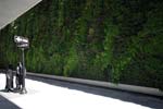 Geoffrey Scott Gainer An expansive green wall using reused and recirculated water shrouds the adjacent parking garage.  The new stair hunkers under Botta’s rotunda. Staff, public, and architects alike bemoaned the removal of Botta’s core stair, mandated by egress requirements.  Geoffrey Scott Gainer The new stair in Botta’s atrium, with a late Calder, allows continuous public access to flow from original west end entrance to Snøhetta’s new south entrance.  Geoffrey Scott Gainer Approaching Botta’s rotunda from the new addition.  Geoffrey Scott Gainer Indirect cove lighting keeps can lights to a minimum. 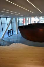 Geoffrey Scott Gainer Richard Serra’s Sequence, at the south entry. 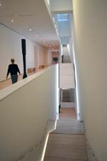 Geoffrey Scott Gainer One of the clusters of stair runs lining the inside face of the cliff-like east wall. 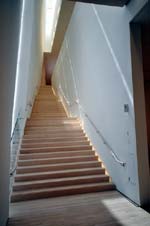 Geoffrey Scott Gainer Stairs narrow as they rise, coaxing visitors to bump elbows.  Geoffrey Scott Gainer One of the “palate cleansers” – windows offering a respite from the galleries.  Geoffrey Scott Gainer The sculpture terrace at the top-floor gallery.  Geoffrey Scott Gainer Eye-popping washroom interiors are designed to spark spontaneous exchanges between visitors. |
© 2016 ArchNewsNow.com